The strenght of a predictive, machine-learning model is often evaluated by quoting the area under the curve or AUC (or similarly the Gini coefficient). This AUC represents the area under the ROC line, which shows the trade-off between false positives and true positives for different cutoff values. Cutoff values enable the use of a regression model for classification purposes, by marking the value below and above which either of the classifier values is predicted. Models with a higher AUC (or a higher Gini coefficient) are considered better.
This oversimplifies the challenge facing any real-world model builder. The diagonal line from (0,0) to (1,1) is a first hint at that. Representing a model randomly guessing, this model with an AUC of .5 is effectively worth nothing. Now assume a model with the same AUC, but for a certain range of cutoffs its curve veers above the diagonal, and for another it veers below it.
Such a model may very well have some practical use. This can be determined by introducing an indifference line to the ROC analysis. The upper-left area of the ROC space left by that line is where the model makes economical sense to use.
The slope of the line (s) is defined mathematically as follows:
slope s = (ratio negative * (utility TN - utility FP)) / (ratio positive * (utility TP - utility FN))
This with ratio negative the base rate of negative outcomes, utility TN the economic value of identifying a true negative, and so on.
Many such lines can be drawn on any square space - the left-most one crossing either (0,0) or (1,1) is the one we care about.
This line represents combinations of true positive rates and false positive rates that have the same utility to the user. In the event of equal classes and equal utilities, this line is the diagonal of the random model.
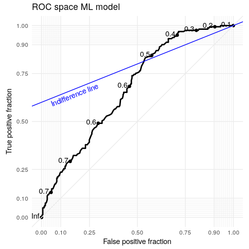
Figure 1: ROC space plot with indifference line.
An optimal and viable cutoff is the point of the tangent of the left-most parallel line to the indifference line and the ROC curve.
The code to create a graphic like above is shown below. Of note is the conversion to `coordfixed` which ensures the plot is actually a square as intended.
library(ggplot2)
library(dplyr)
r.p <- nrow(filter(dataset, y == 'Positive')) / nrow(dataset)
r.n <- 1- r.p
uFP <- -10
uFN <- -2
uTP <- 20
uTN <- 0
s <- (r.n * (uTN - uFP)) / (r.p * (uTP - uFN)) # equals .4
ROC.plot + # start from a previous plot with the ROC space
  coord_fixed() + # Fix aspect ratio - allows to convert slope to angle and also better for plotted data
  geom_abline(intercept = ifelse(s < 1, 1-s, 0), slope = s, colour = "blue") +
  annotate("text", x = 0.05, y = ifelse(s < 1, 1 - s -.01, 0), angle = atan(s) * 180/pi, label = "Indifference line", hjust = 0, colour = "blue")
Posted on Wednesday 11 January 2017 at 04:12