Trying to plot the income per capita in Australia on a map, I came across a perfectly good reason to make good use of a spatial query in R.
I had to combine a shapefile of Australian SA3's, a concept used under
the Australian Statistical Geography Standard meaning Statistical Area
Level 3, with a dataset of income per postal code. I created a matrix of
intersecting postal codes and SA3's, and obtained the desired income per
capita by SA3 performing a matrix multiplication. If the geographical
areas were perfectly alignable, using a function like st_contains
would have been preferred. Now I fell back on using st_intersects,
which results in possibly assigning a postal code to 2 different
statistical areas. Alternative approaches are welcome in the comments!
As Australia is so vast, and the majority of its people are earning a living in a big city, a full map does not show the difference in income per area at this level of detail. Instead, I opted to map some of the key cities in a single image.
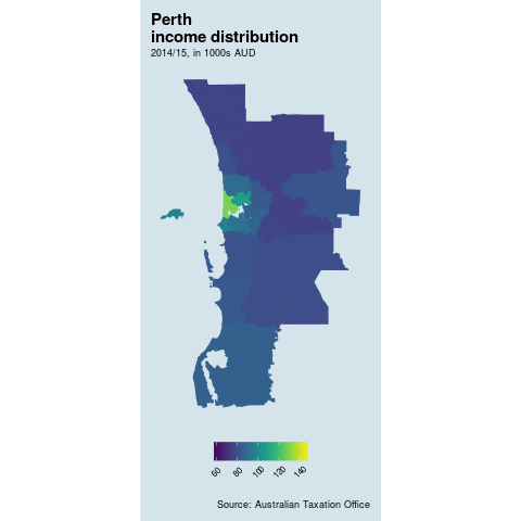
Figure 1: Income distribution in major AU cities
The full code is available on my git server for you to clone using
git clone git://git.vanrenterghem.biz/R/project-au-taxstats.git.
Posted on Thursday 16 November 2017 at 15:07