It is useful to apply the concepts from survival data analysis in a fintech environment. After all, there will usually be a substantial amount of time-to-event data to choose from. This can be website visitors leaving the site, loans being repaid early, clients becoming delinquent - the options are abound.
A visual analysis of such data can easily be obtained using R.
library(survminer)
library(survival)
library(KMSurv)
## Create survival curve from a survival object
#' Status is 1 if the event was observed at TimeAfterStart
#' It is set to 0 to mark the right-censored time
vintage.survival <- survfit(Surv(TimeAfterStart,Status) ~ Vintage, data = my.dataset)
## Generate cumulative incidence plot
ci.plot <- ggsurvplot(vintage.survival,
                      fun = function(y) 1-y,
                      censor = FALSE,
                      conf.int = FALSE,
                      ylab = 'Ratio event observed',
                      xlab = 'Time after open',
                      break.time.by = 30,
                      legend = "bottom",
                      legend.title = “",
                      risk.table = TRUE,
                      risk.table.title = 'Number of group',
                      risk.table.col ="black”,
                      risk.table.fontsize = 4,
                      risk.table.height = 0.35 )
This produces a plot with a survival curve per group, and also includes the risk table. This table shows how many members of the group for whom no event was observed are still being followed at each point in time. Labelling these "at risk" stems of course from the original concept of survival analysis, where the event typically is the passing of the subject.
The fun = function(y) 1-y part actually reverses the curve, resulting
in what is known as a cumulative incidence curve.
#+ATTRHTML :width 442 :class img-fluid :alt Survival/incidence curve and risk table
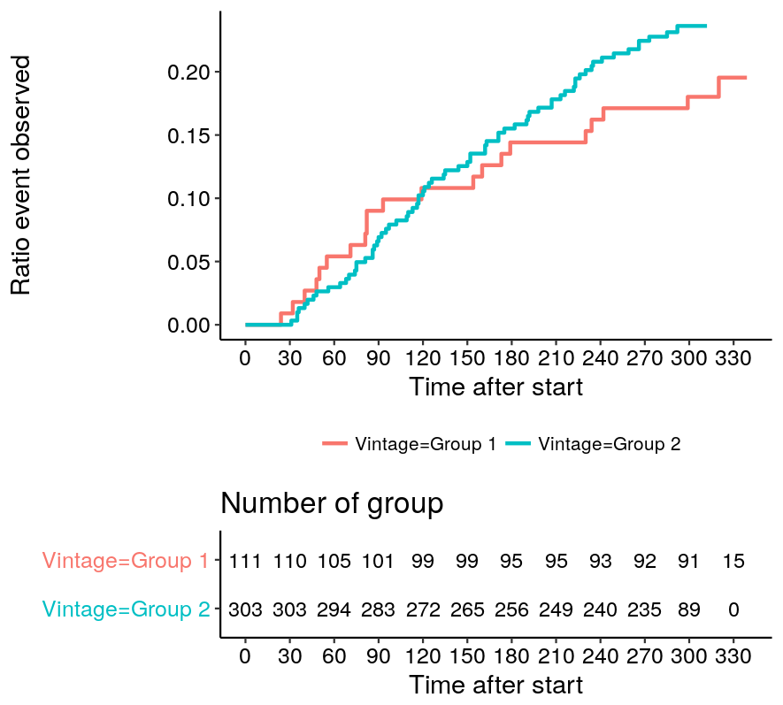
Underneath the plot, a risk table is added with no effort by adding
risk.table = TRUE as parameter for ggsurvplot.
Checking the trajectory of these curves for different groups of customers (with a different treatment plan, to stick to the terminology) is an easy way to verify whether actions are having the expected result.
Posted on Saturday 10 December 2016 at 15:49